BI through Visualization
Multilateral Organizations Utilize Visualization Tools to Improve Business IntelligenceThe Challenge
Organizations such as the World Bank, the Inter-American Development Bank, the UN and others, collect and compile summary data, also known as indicators, to perform different comparisons among countries and within a country over time. These organizations put such indicator data into spreadsheets and try to generate graphs and charts with the intent of driving insights. Recently, they have begun posting some of that data to SOCRATA, to enable the querying of subsets of data. Although they can generate interactive visualizations with such queries, in most cases they just produce tables with many filters and very basic charts.
However, what is needed is not to produce the same table with many dropdowns to filter the data, but to present the information so as to enable the benefits of visualizations and business intelligence, such as:
- Answer questions (or discover them)
- Make decisions
- See data in context
- Support graphical calculation
- Find patterns
- Present arguments or tell a story
- Inspire new insights
The Solution
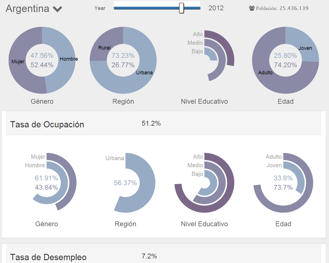
Looi Consulting developed an approach that enables understanding the data at a glance: Country Indicator Visualization. This tool generates reports filtered by selecting a group of countries, one category of indicators with one specific indicator, one breakdown and several options within the breakdown and one specific year. The information is presented first at an aggregated level and then is broken down into categories. Even the categories can be broke down to subcategories and the categories’ and subcategories’ panels can be collapsible to present less or more information simultaneously. However, this could make the visualization to look busy and complex. Thus, an alternative approach is to add even more interactivity to the visualization. For example, if a user clicks on “Male” on the Occupation Rate, the values of the rings or donuts for Region, Educational Level and Age will be updated to reflect that the user is interested in the Occupation Rates for Males by region educational level and age. Similarly, clicking on a ring on the other subcategories will update the other values accordingly. Hence, this type of visualization can, in fact, become an interactive infographic that allows exploring all combinations of the data easily and effectively.
Our solution approach doesn’t begin or end with preconceived notions; we strive to understand the underlying problem, leading us to optimal outcomes.
Capabilities
Looi Consulting has considerable expertise in conceptualizing and defining the needs for complex, multi-lateral organizations. In particular:
- BI Development: Engineering compact, efficient solutions.
- BI App Design and Architecture: Designing BI solutions to meet specialized business needs and to show relationships or trends hidden in customer data.
- BI Visualization: Designing and developing solutions that drive insights and action.
Timeline
Looi Consulting performed a feasibility and research study followed by several months of prototype development and productization of the solution using agile development methodologies.
%
Improved Data Management
%
Value Derived from Data
%
Insights Gained
New BI Solution
Insightful BI Solution
Data Quality
BI Insights
- Stakeholder Satisfaction 100%
- Engagement 85%
- Productivity 75%
End Results Drove Users’ Understanding of Data
We started with a large, complex and impenetrable set of tabular data. But, the change was remarkable. A dramatic improvement in data manageability was achieved by designing and implementing powerful new visualizations. The outcome enabled policy makers, business owners, government officials and the public to understand the meaning of the indicator data that had been painstakingly collected. Our solution made valuable data accessible to all users, reducing the mental effort to make sense of the indicators.
Related Articles